Free Art Newsletter filled with the best oil painting and drawing tips, directly from the Atelier tradition. Timeless techniques to enjoy weekly to grow and inspire.
Why Shadows are Not Just Darker Colors - The Atelier Newsletter
|
Florent Farges
Free Art Newsletter filled with the best oil painting and drawing tips, directly from the Atelier tradition. Timeless techniques to enjoy weekly to grow and inspire.
Many painters and draftsmen don’t actually have a clear, methodical progression when building a drawing or even a painting - which is, if you think about it, a drawing made with paint. The Problem with starting with no method is that, if stages are unclear, bad results are inevitable and there’s no way to know where things went wrong. Today, to celebrate the launch of my new drawing course, the Systematic Drawing Method, we’ll talk about the 5 essential stages of drawing: Block-in, Mass-in,...
A Patreon member recently told me something I hear all the time:“I never mix enough paint. I don’t know why…” At first glance, this sounds like a quantity problem. Not enough paint on the palette, not enough mixtures prepared in advance. But in reality, it almost never is the main problem. Most of the time, the issue isn’t how much paint you mixed on your palette in advance — it’s how the paint is being picked up with the brush.. I thought this would be the perfect occasion to talk about a...
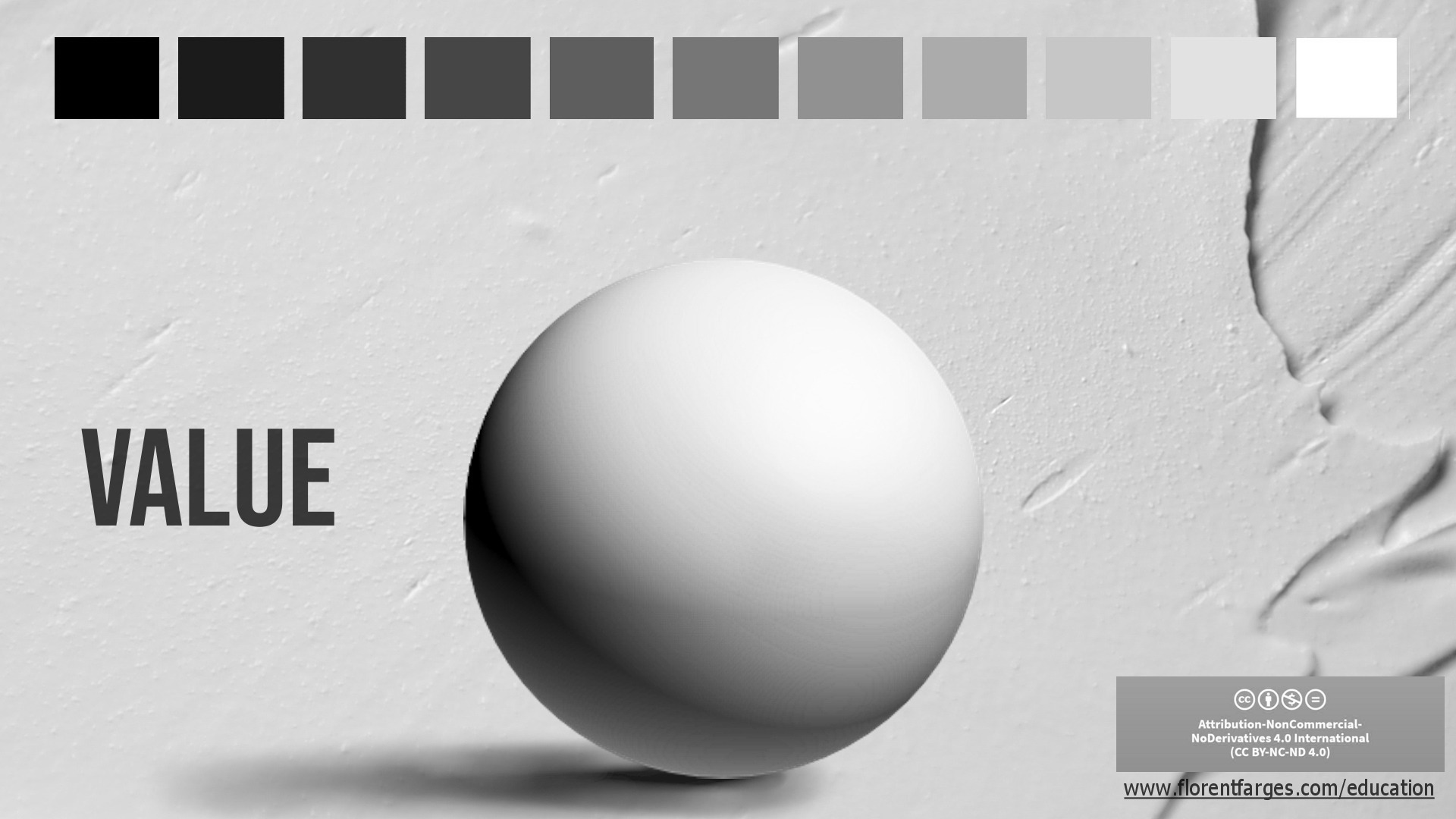
If you want to learn oil painting properly, painting an eye is one of the best places to start. It’s connected to portrait painting, but without the intimidation of a full head. In a small space, you’ll deal with drawing accuracy, value control, edge quality, color temperature, and brushwork — all the fundamentals, distilled into a manageable exercise. This is a classical approach, ideal for beginners, because it teaches you how to think while you paint, not just how to copy what you see....